EDo is a neighborhood association made up of developers, business owners, and residents committed to making East Downtown the most vibrant, classy, and walkable live-work-play neighborhood in Albuquerque.
Design Process
Strengths
The logo was already a “wordmark” logo which highlights EDo’s unique name and identity. In addition, the sharp angles in the arrow communicate competence and strength.
Opportunities for Improvement
The details that made the logo unique details were small & trendy, not timeless. Because of that the logo required color, not passing the black & white test. Beside that, the font of “East Downtown” was difficult to read and the lowercase “n” communicated an element of unprofessionalism.
Refresh Inspiration
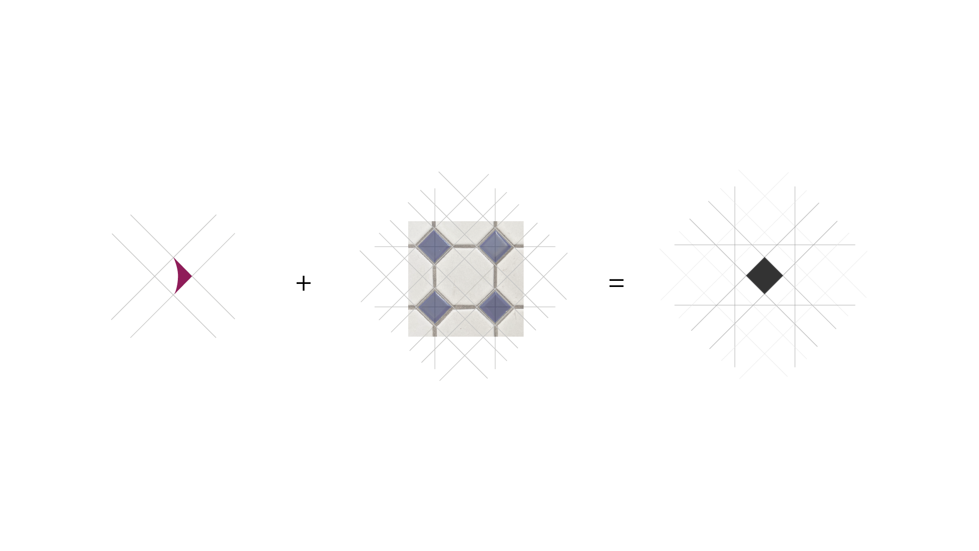
Victorian tile pattern | historic but timeless | signifies place/environment
New EDo Logo
The new design retains the strengths of the previous design while also taking advantage of the opportunities for improvement.
Versatility
Additional logos are for example only. Context has not done work with these businesses.
Vibrant. Classy. Walkable.

SERVICES PROVIDED:
Logo
Website
Messaging
Letterhead
INTERESTED IN GETTING YOUR PROJECT STARTED? hello@contextabq.com


